Writing is a part of our daily lives. Think about it.
We write things like lists, emails, cards, and directions on a pretty regular basis. We also sometimes find ourselves creating newsletters, articles, and recipe cards.
Wouldn’t it be wonderful to have your child practice some of those same practical writing activities? It would make writing more meaningful for him. It would also help him realize how valuable writing is.
To help you out, I created a list of practical writing activities that you can do with your child. Some are aimed at certain careers. Others just generally used by everyone. As always, choose ones that are appropriate to the age and skill level of your child.
30 Practical Writing Ideas
- A list (shopping, for a trip, things to do)
- A card (thank you, birthday, etc.)
- A memo
- A map and directions from one place to another (without the help of Google maps ;))
- A newsletter
- A calendar. These are fun to design and kids can throw things like quotes on them.
- A letter or email
- An invitation
- Rules (for the house, an activity, a game, etc.)
- A “how to” article (how to ride a bike, how to clean your room, how to be honest, etc.)
- A book or product review
- A personal blog post
- A prayer
- A description of something that happened to you
- A newspaper (could be about your homeschool and include things like editorials, want ads, funnies, etc.)
- A magazine article
- A song or chant to help you memorize something
- A recipe
- A survey
- Instructions
- A journal or diary
- A brochure
- A poster
- A crossword or word search (good for reviewing subjects like science and social studies)
- A table or chart (good for comparisons or showing data)
- A postcard
- A guide
- A mind map
- A question for a forum
- A website (see details below)
Designing a Website on Paper
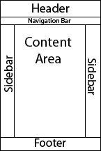
 As a bonus, here are the instructions for designing a website layout on paper.
First, take a 12″ x 18″ piece of white paper and lay it vertically on a table. Have your child draw a straight line across the narrow end about 2 1/2 inches from the top. This area will be for the Header. Then he should draw a line about 3/4 inch below this one. This area will be for the Navigation Bar. Next, he can draw another horizontal line about 1 1/2 inches from the bottom. This will be for the Footer. If your child wants one or two Sidebars, he can draw vertical lines about 2 inches from the side edges. Here’s what goes in each area.
The Header is where the name of the website usually goes. It also includes some kind of colorful background and sometimes a logo. Let your child decide how he would like to make this.
The Footer usually has links for things such as Privacy Policy, Disclaimer, Contact, About, and Terms and Conditions. Tell him to write those words in this section. (He wants his site to be legal, right?)
The Navigation Bar (or NavBar as web designers call it) is for the main categories of the site. Visitors click on these categories to go to those pages. Let your child decide the categories that would be appropriate for his site and write them in this section with a vertical line dividing them.
If your child wants a Sidebar or two, he can put things like Cloud Tags, Ads, links to Facebook and Twitter pages, links to popular articles, a search box, etc.
The Content Area is for the articles or blog posts. Let your child fill this in with an article or post related to his site.
Last, but not least, your child can lightly shade in each section with the colors of his choice. You might want to tell him that Content Areas are usually (but not always) white for easier reading.
Ta-dah! Your child designed his own website.
Did I miss anything? Do you have any ideas for practical writing activities that I didn’t think of? I would love to hear about them below.


